Snapchat Payments
Feature exploration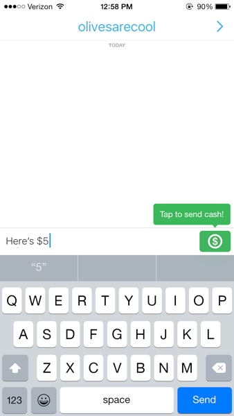
In 2015 Snapchat had a Snapcash feature in chat.
When you put a dollar amount in your chat message, the snap button turns into a cash button, allowing you to send money.
Snapchat and Venmo explored a partnership that would allow Venmo to power Snapcash.
To gain the partnership, we wanted to present ways of enabling a smooth and simple interface for making payments through Venmo.
I worked closed with a product manager. Our process involved mostly individual ideation and exploration, interspersed with regular checkins where we shared ideas.
I was the sole designer on this project.
Our goals were straightforward.
Benefit both companies.
Be simple, easy, and secure.
Challenges
-
Lack of engineering bandwidth
-
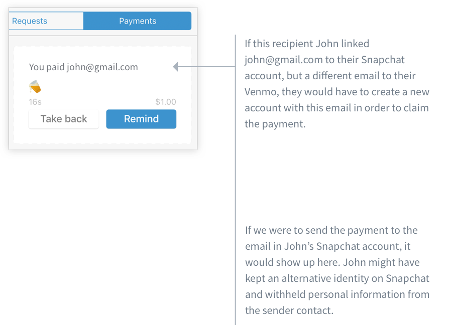
Not knowing the Venmo user associated with the Snapchat user
We could easily get the phone number or email address on the Snapchat recipient user’s account and send a payment to either. However, if someone uses different emails for Snapchat and Venmo, they would not be able to claim the payment under their existing Venmo account.
-
Protecting the privacy of Snapchat users
If we send payments to the email or phone number associated with a Snapchat account, that person’s information could show up in Venmo. This information is something that’s never revealed in Snapchat.
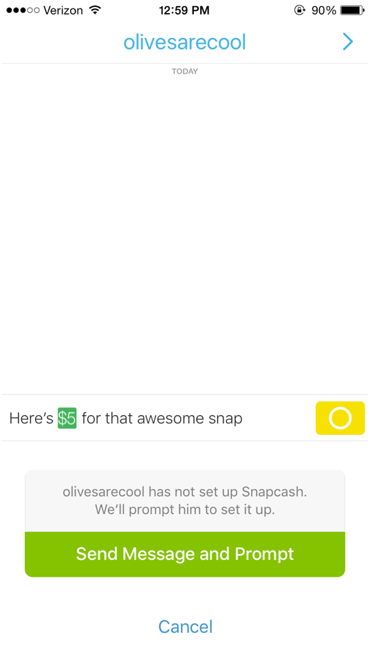
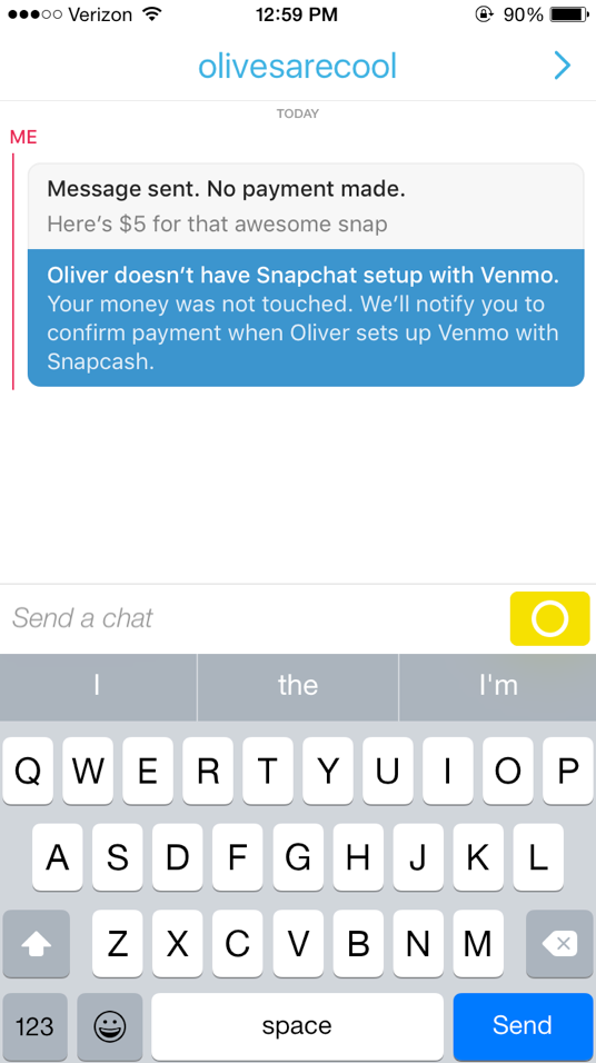
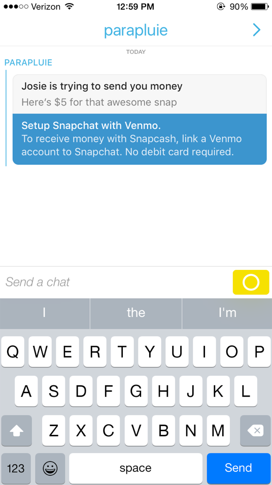
Our first concept required the recipient to have linked a Venmo account before the payment could be fully made.
This method doesn’t trigger a Venmo payment immediately, which means a Snapchat user’s information would not be revealed.
Once connected, the sender has to resend the payment.
We decided on this because the recipient might take weeks or months before they connect Venmo. And in that time, the sender’s Venmo balance may have changed. Usually with Venmo payments, subtracting the balance is immediate, not upon delivery.
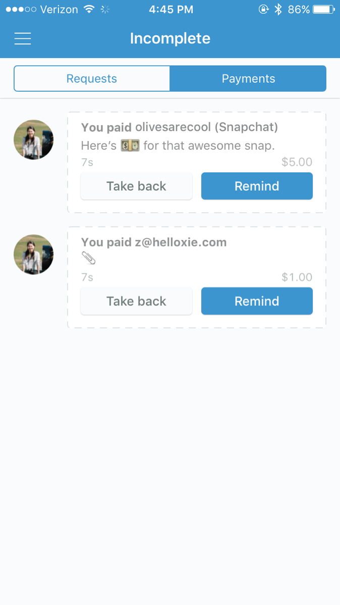
We could have subtracted the balance, then had the recipient claim the money, but that means there would need to be a way for the sender to cancel the payment while it was unclaimed. Here again, we get into the issue of showing a pending outgoing payment and showing the Snapchat user’s information.
In this version we decided to make this trade-off.
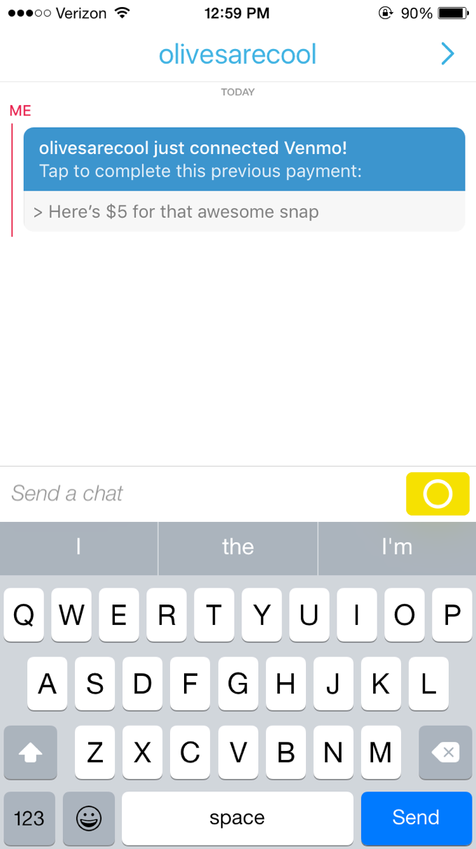
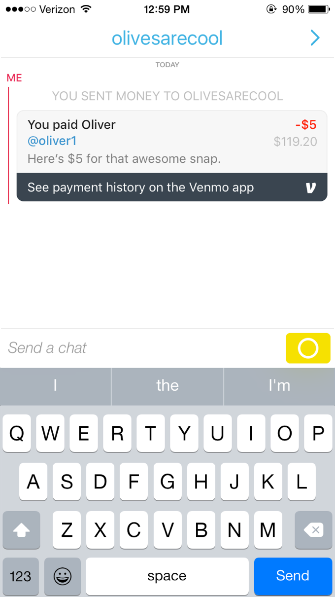
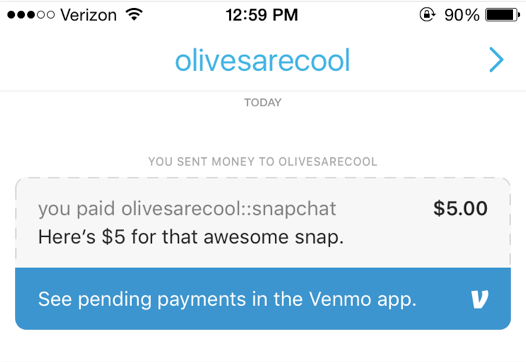
When the payment is complete, the user sees essential information like their balance, but for any other actions they are directed to the Venmo app. This benefits Venmo in increasing active users and engagement.
Both our team and the Snapchat team agreed this wasn’t the most elegant solution.
This flow makes paying slow and cumbersome, and there was no distinct benefit to Snapchat. We brainstormed some more.
Our second concept was based on the idea of an alternative identity.
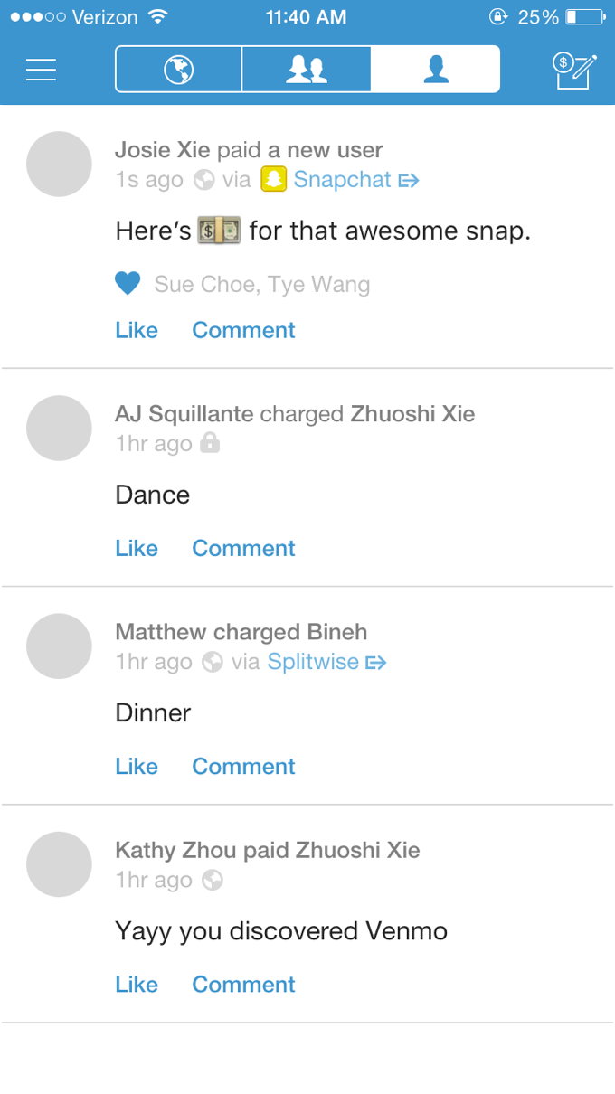
An email or a phone number (unassociated with any existing Venmo accounts) are both seen as essentially a new user on Venmo, or in other words, an identity. What if a Snapchat username behaved the same way?
In this version, we could even drive new users to Snapchat easily.
We liked this idea, so we moved on to some visual design to solidify our pitch.
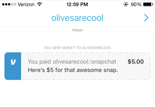
Here we explored a few different ways to display a confirmation before payment.
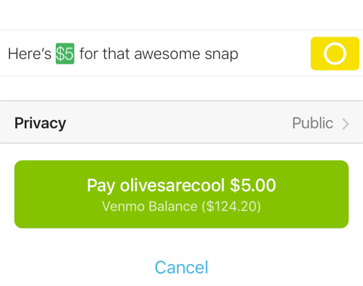
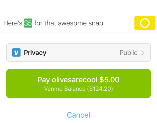
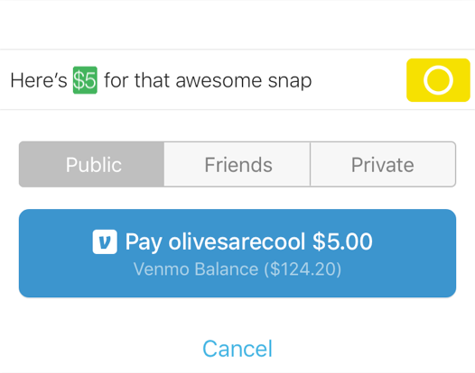
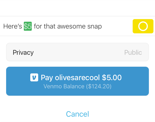
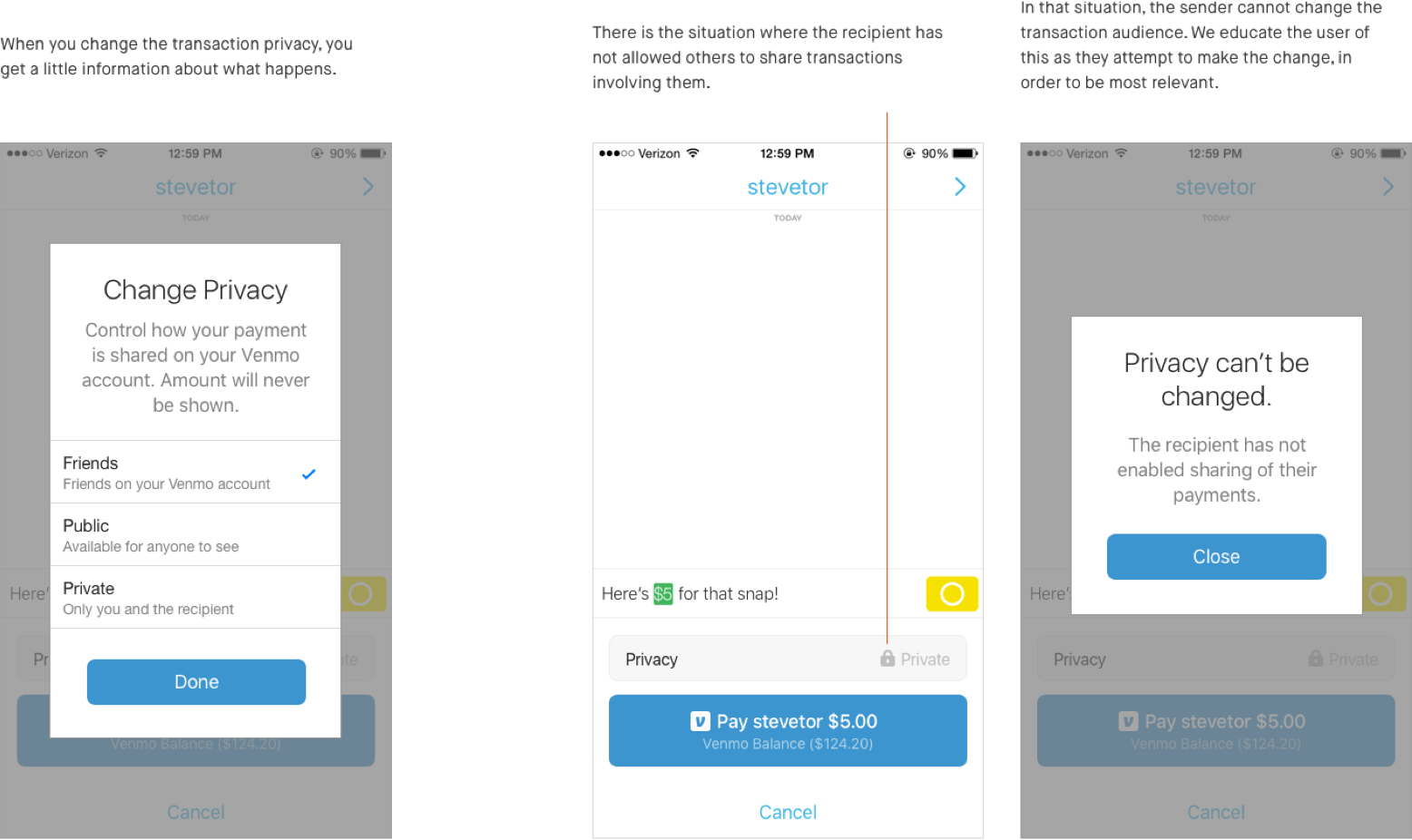
We added some elements to help communicate privacy settings.
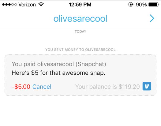
We iterated on the Venmo component.
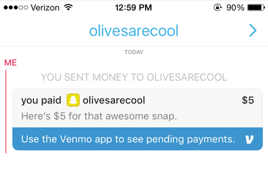
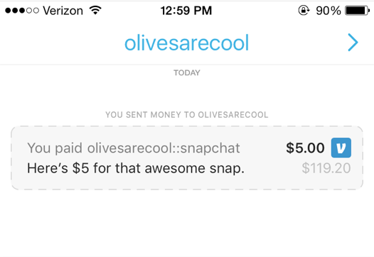
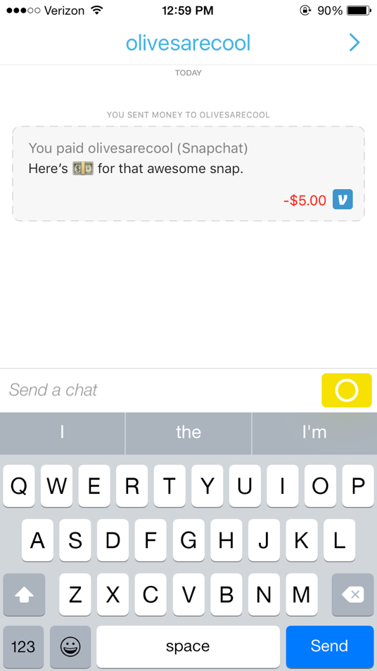
We ended up here, where a Venmo badge brands the component, and the border changes between dashed to solid to represent the pending and completed states.
The content reflects the layout of stories in the Venmo app, something that acts as both a brand element, as well as a familiar piece of UI to Venmo users.
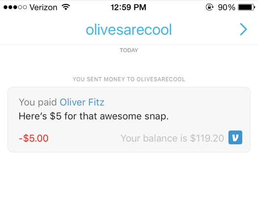
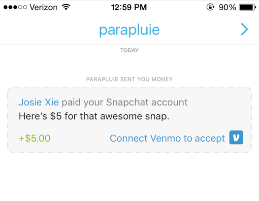
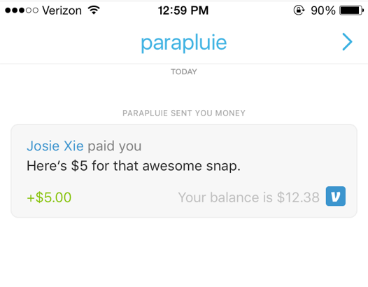
For privacy, we added a way to hide the payment amount, and made sure it was on brand with Venmo as well.

Today, I would approach a few things differently.
-
Exploring more ideas and generate ideas collaboratively.
In the beginning I jumped straight to solutions. It would have been better if I spent some time just producing a wide range of options, and thinking broadly about the problem. It would also have been good to include others’ ideas via a facilitated brainstorm.
-
Bring data to the design.
This would’ve required additional time, but testing some of the elements, like comprehension of the Venmo component in chat, would have helped guide the design and enhance the pitch.
-
Design without engineering constraints in mind.
Directing my thinking towards more of blue-sky concepts in the beginning might have produced di erent results. It’s better to have an ideal version and dial it down to what is feasible, than to design only with the feasible in mind.
