Redesign
Visual design & brand applicationOur marketing team hired external contractors to design a new brand.
Boom. Suddenly, there was a new logo and new colors and none of our product designers were involved.
We asked if we could still propose changes but it seemed like we were stuck. We needed to figure out how the new brand was going to apply to the Venmo app.
In the first phase, I paired closely with another designer.
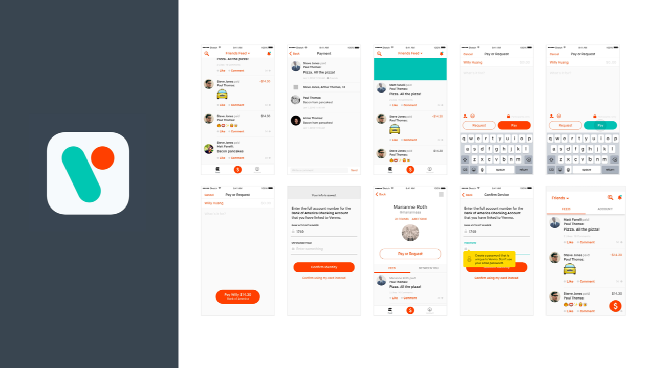
We paired and worked on the same Sketch file, iterating on type and color choices. We had critiques with the rest of the design team, the external marketing designer, as well as the marketing and product teams.
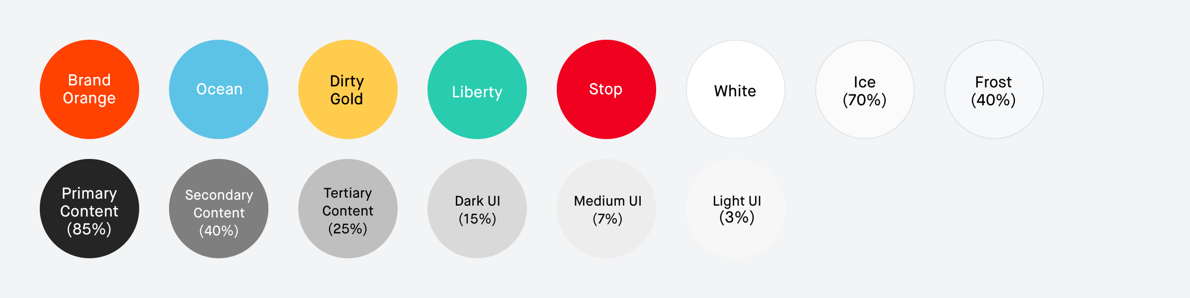
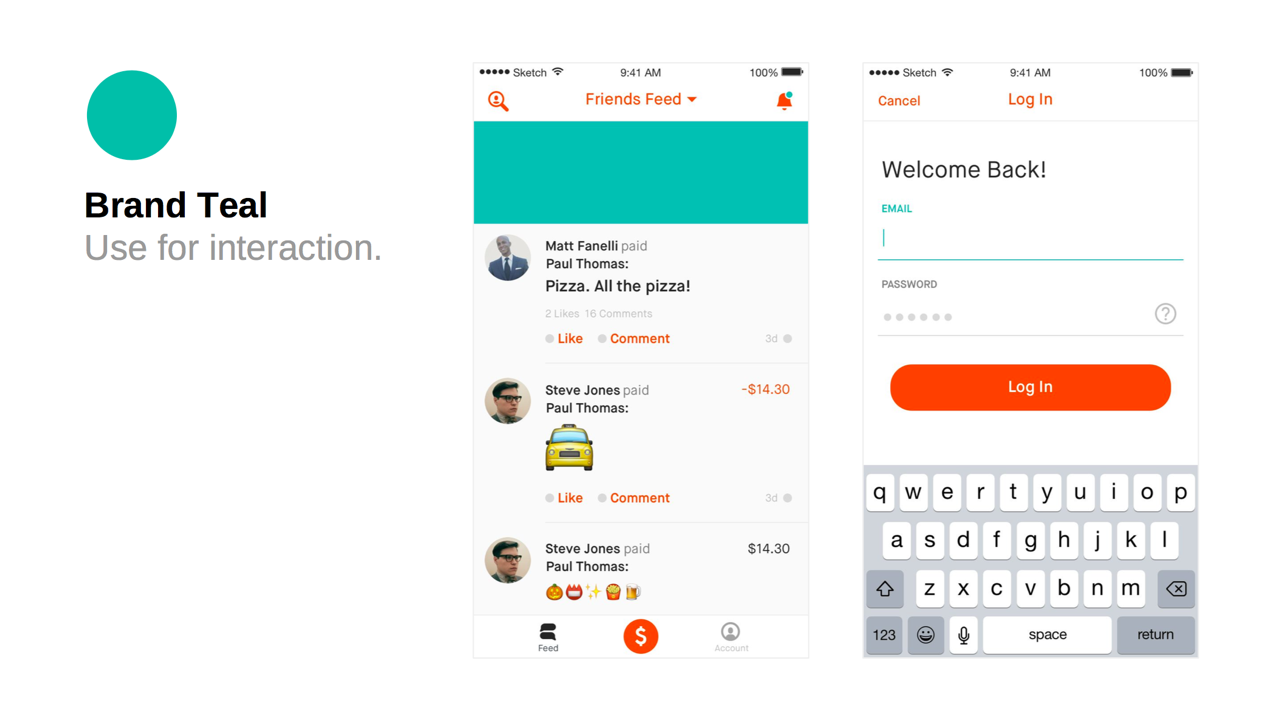
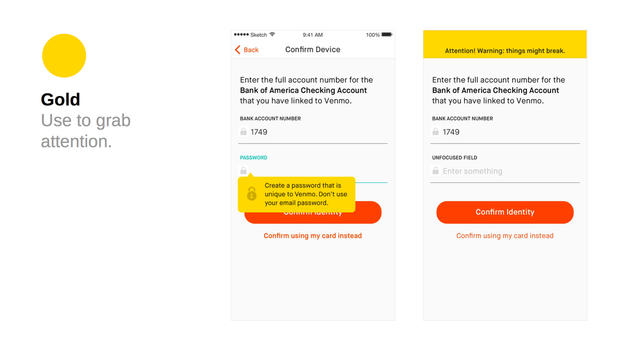
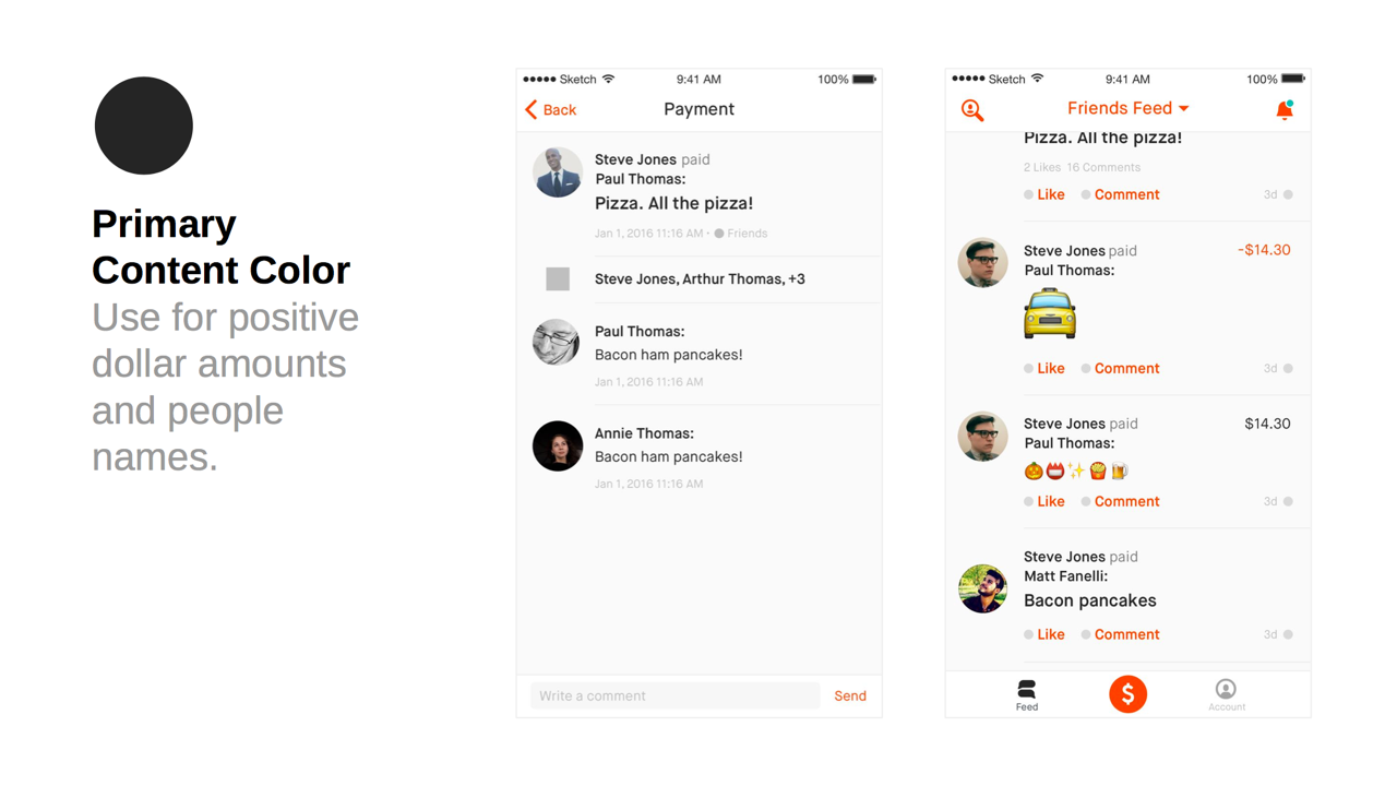
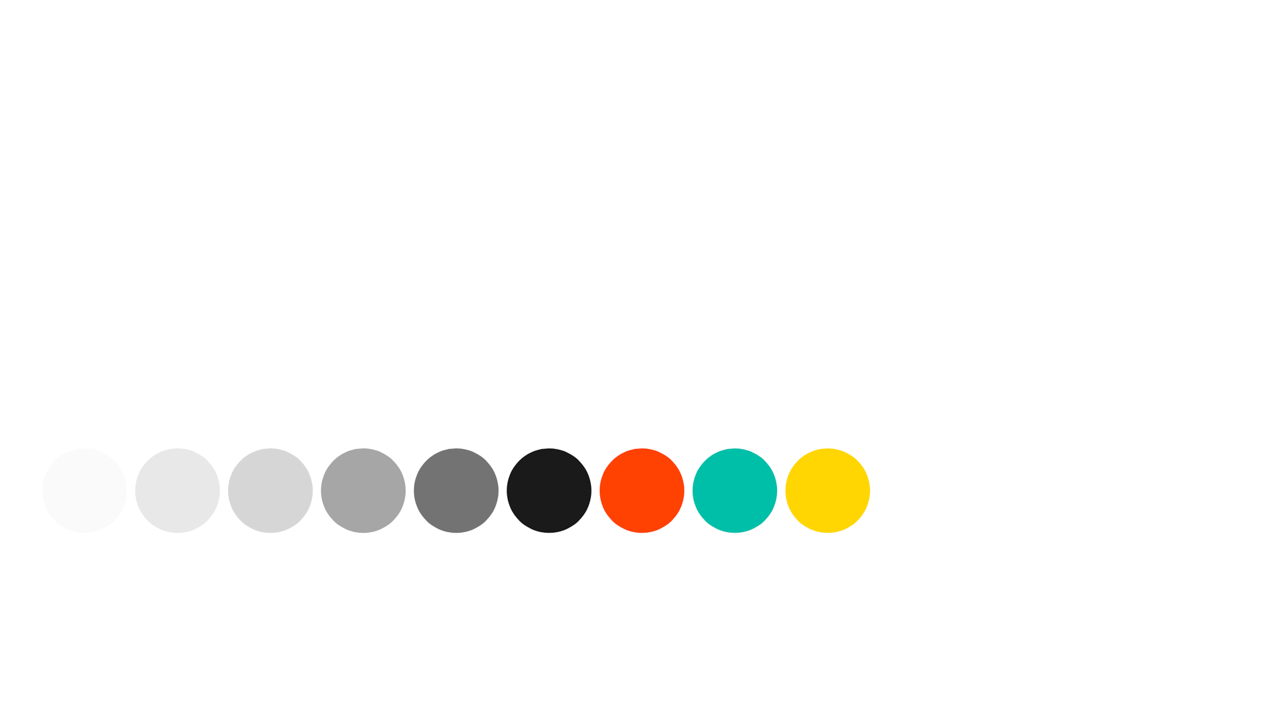
We took the brand attributes of boldness and authenticity to develop colors and type styles.
We looked at other apps, and tried a lot of different things. The brand suggested that we were not to be afraid of being bold and daring in our visual design.
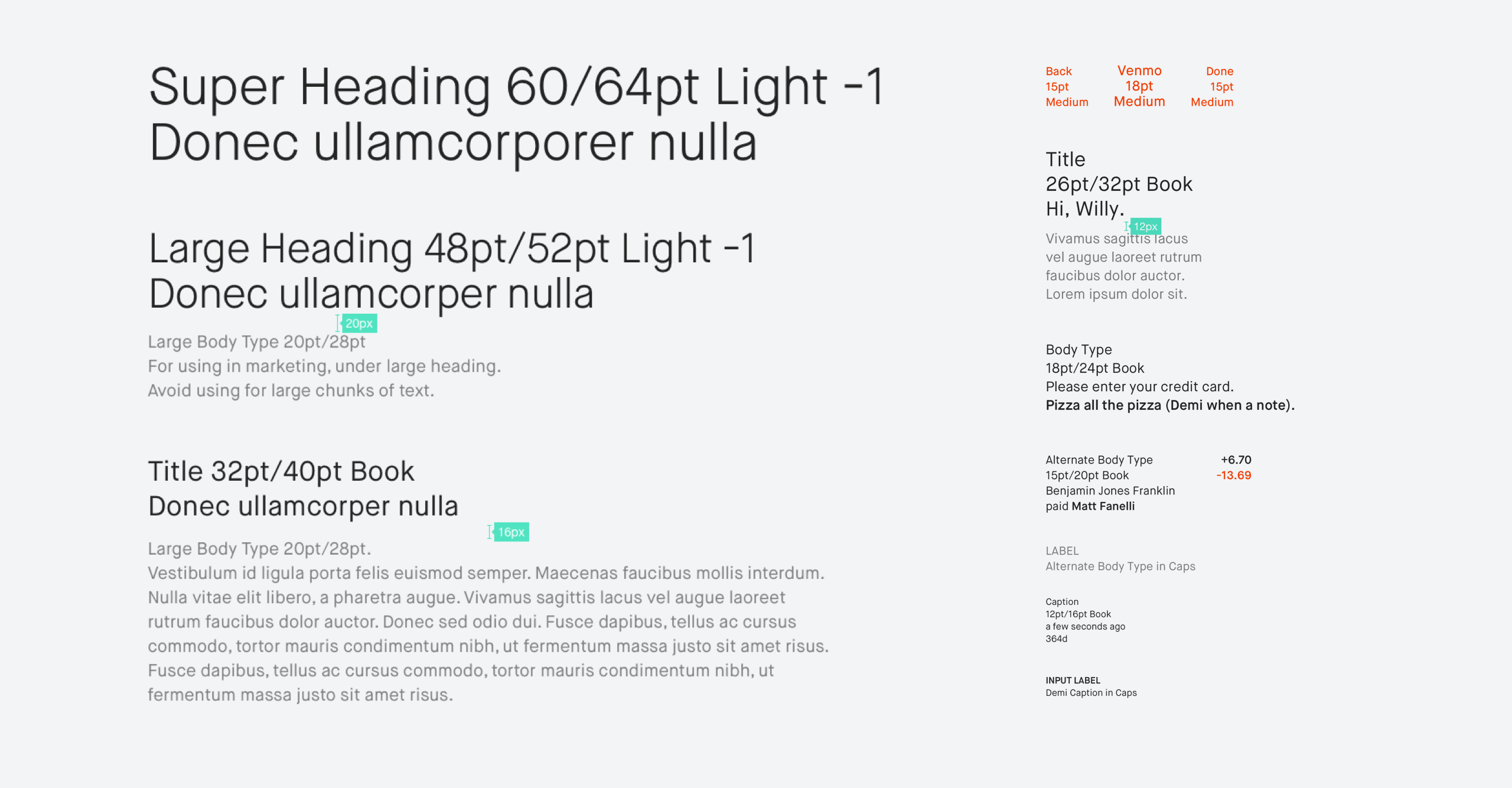
After many rounds of iteration, we arrived at this set of styles.
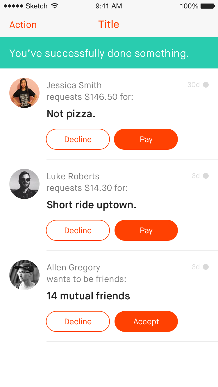
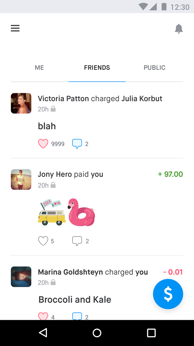
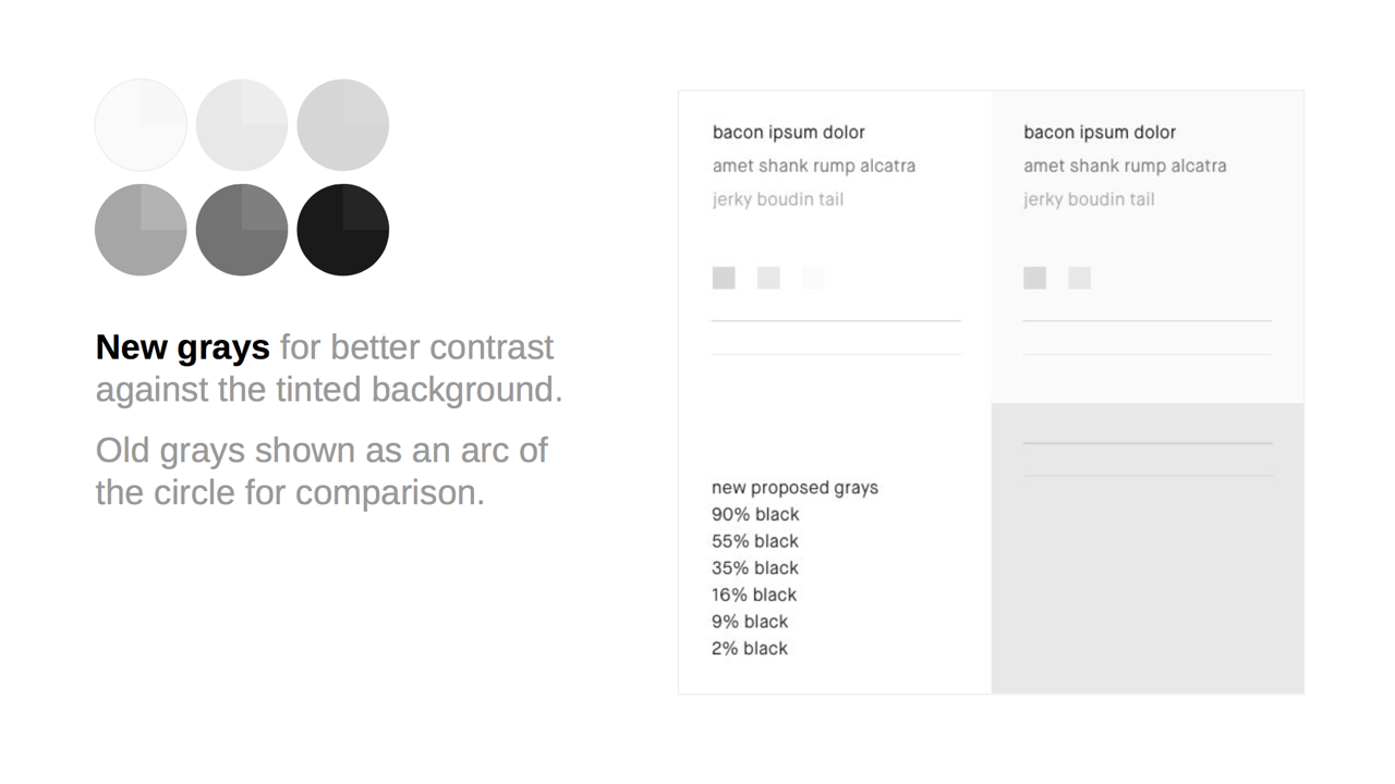
It's bold compared to the safe, blue-and-white UI we had at the time, without going over the top. In determining the styles, we considered factors like legibility and contrast, and how well we can apply it across a variety of use cases.
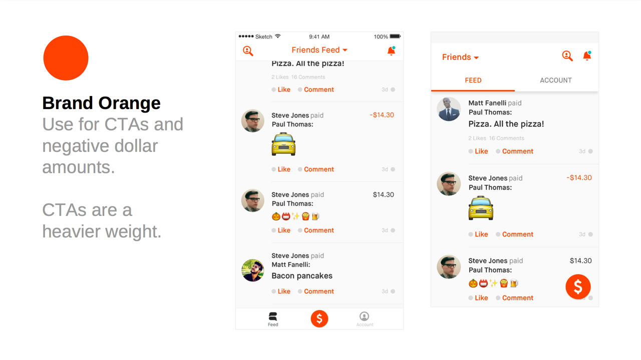
We spent a lot of time and many critiques discussing the color of secondary buttons. Eventually we decided that what worked well was not a color, but instead an outlined button.
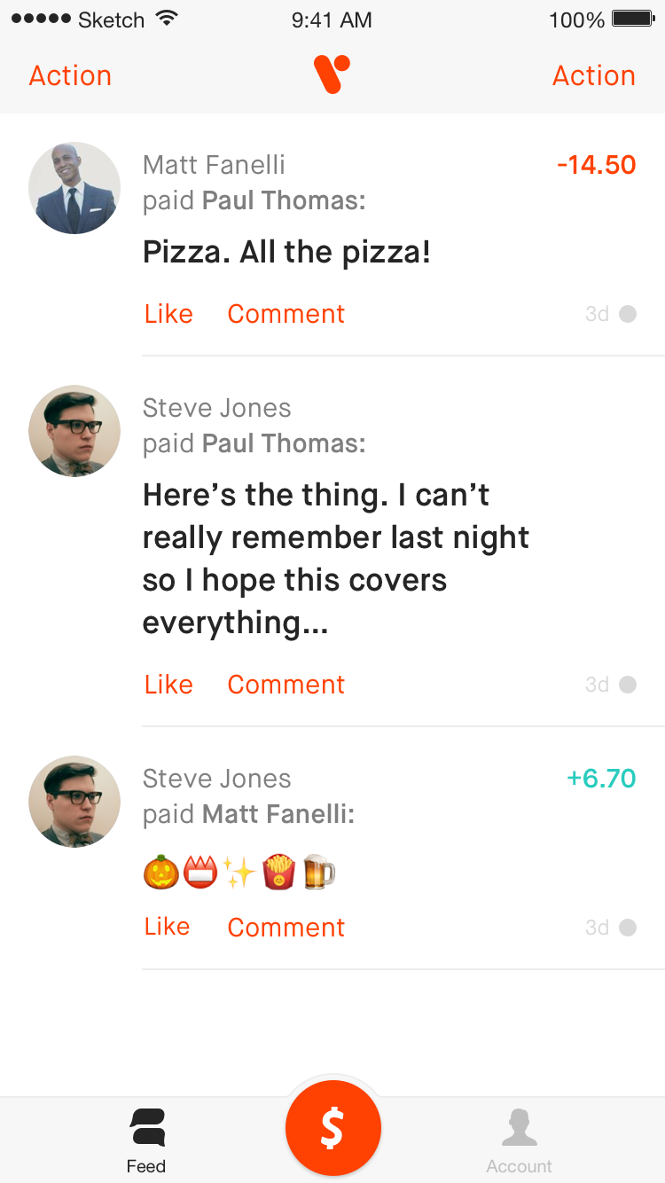

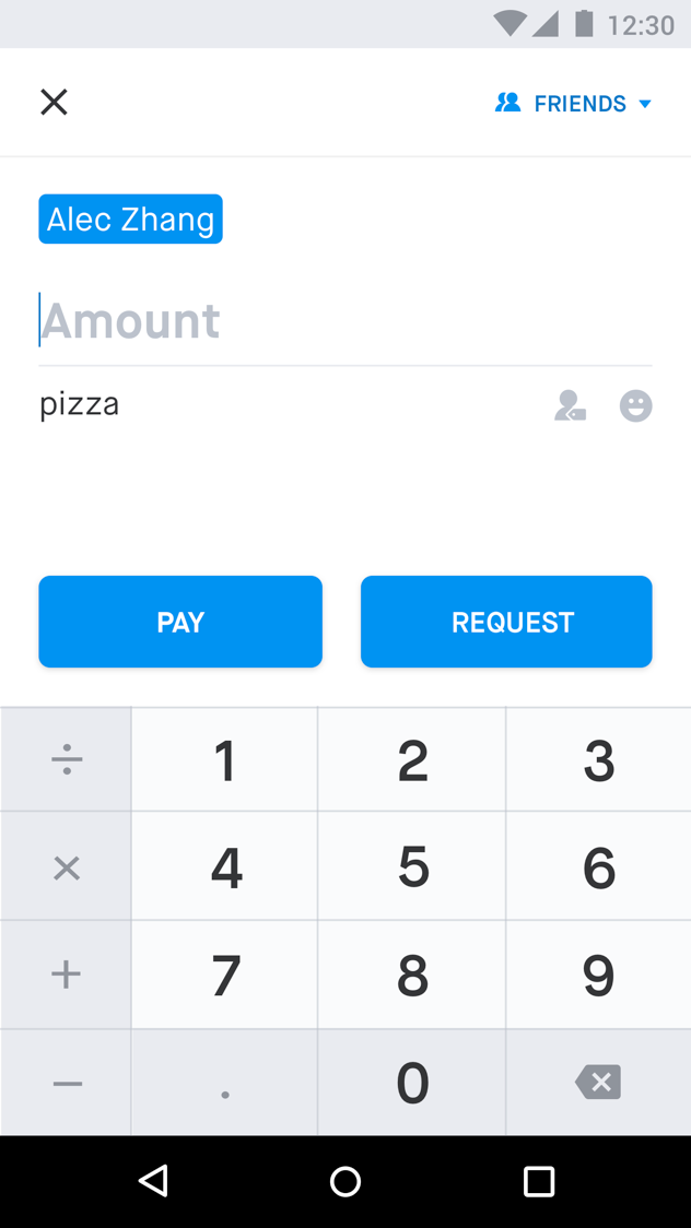
We already had plans to start moving towards emphasizing the note over the people in each story, so it was natural for us to use a larger and bolder size for the note in this project.
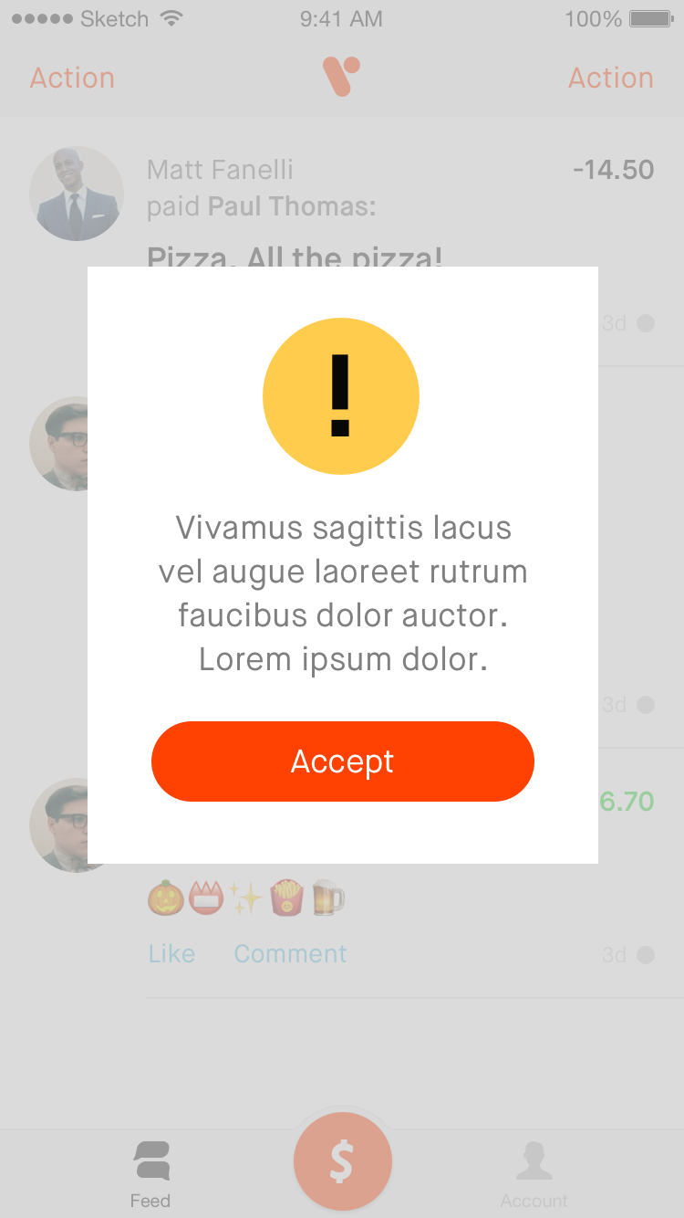
We played around a lot of secondary colors, and using other colors to tone down the bright orange. We landed on a concept of showing the secondary blue on a pull-to-refresh interaction.
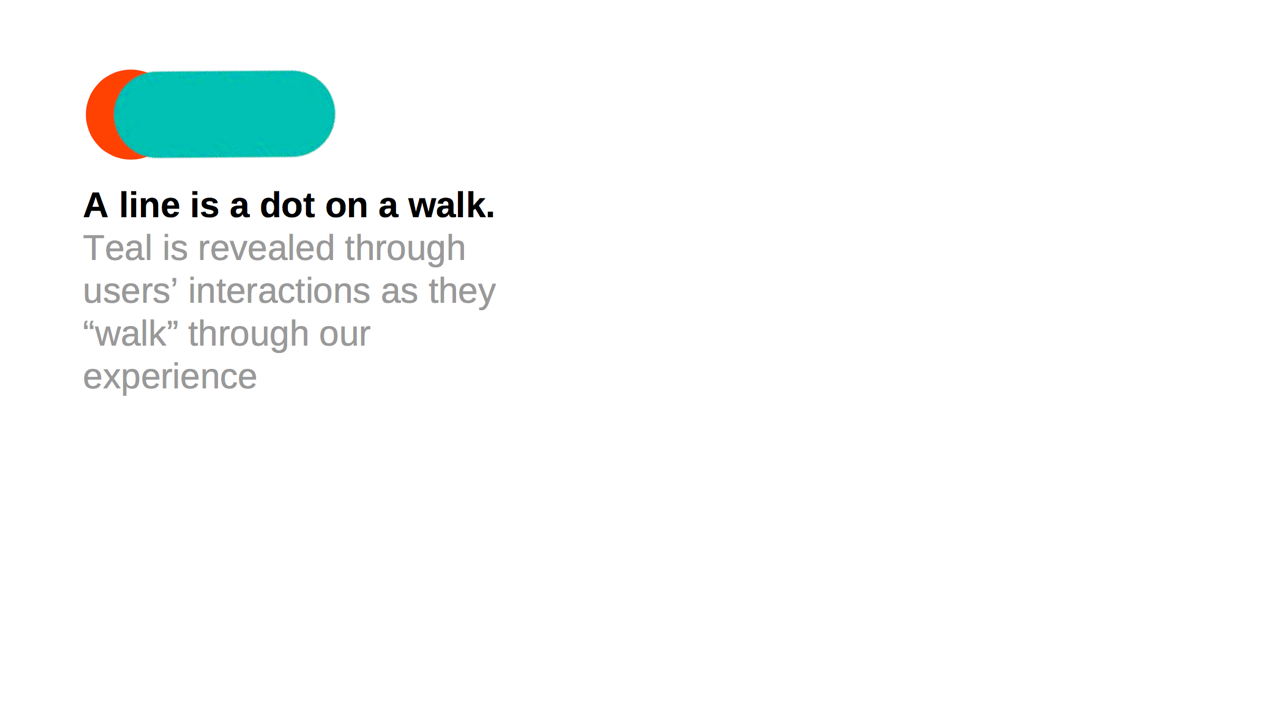
Suddenly, our brand color changed from orange to teal.
The marketing team discovered a very similar brand that was red. So they put out a poll to the wider team, with four shades of blue as options. Teal won.
In this phase of the project, I worked alone, with regular checkins with stakeholder teams.
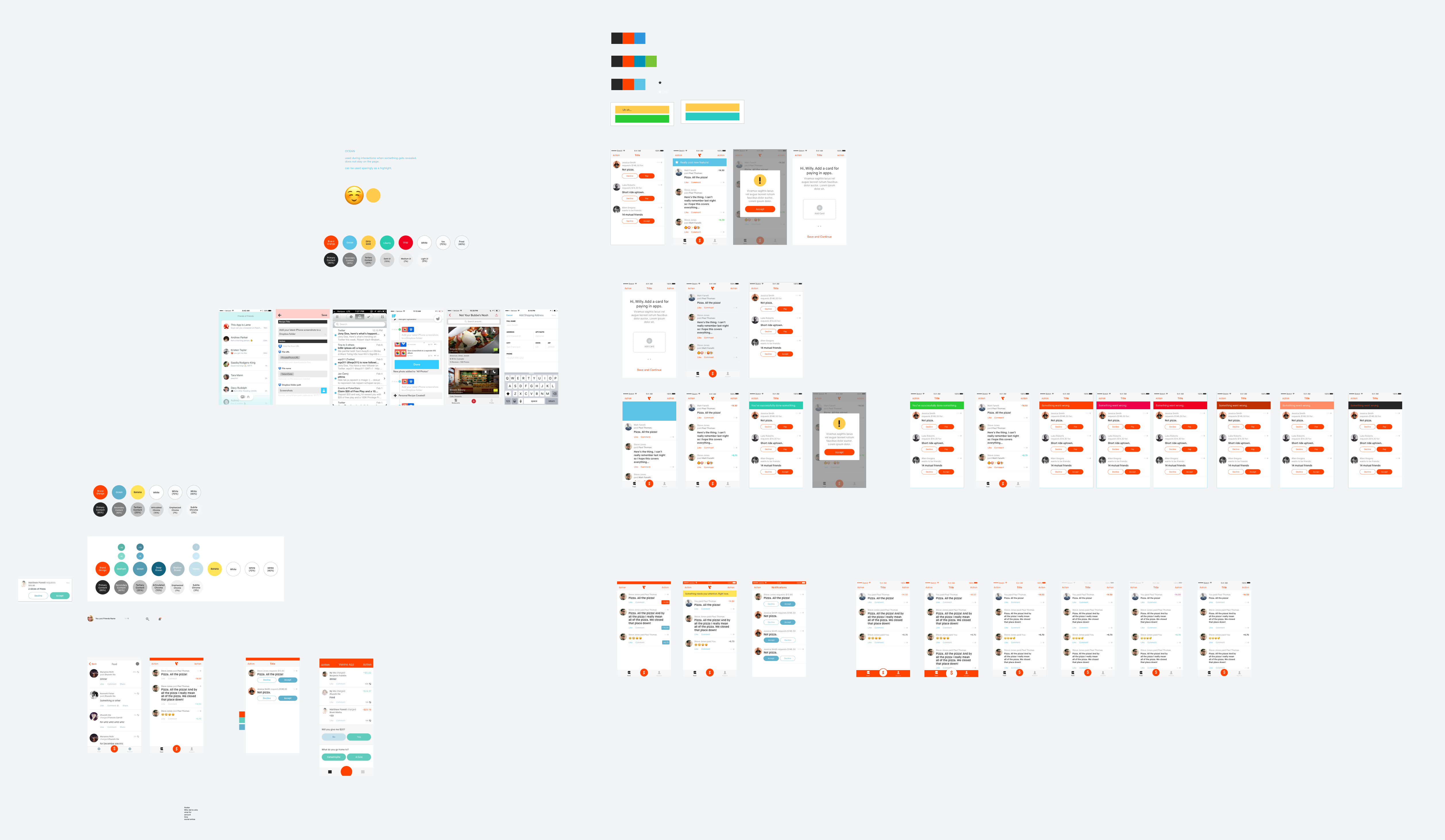
I explored a number of different palettes and applied the colors to the app.

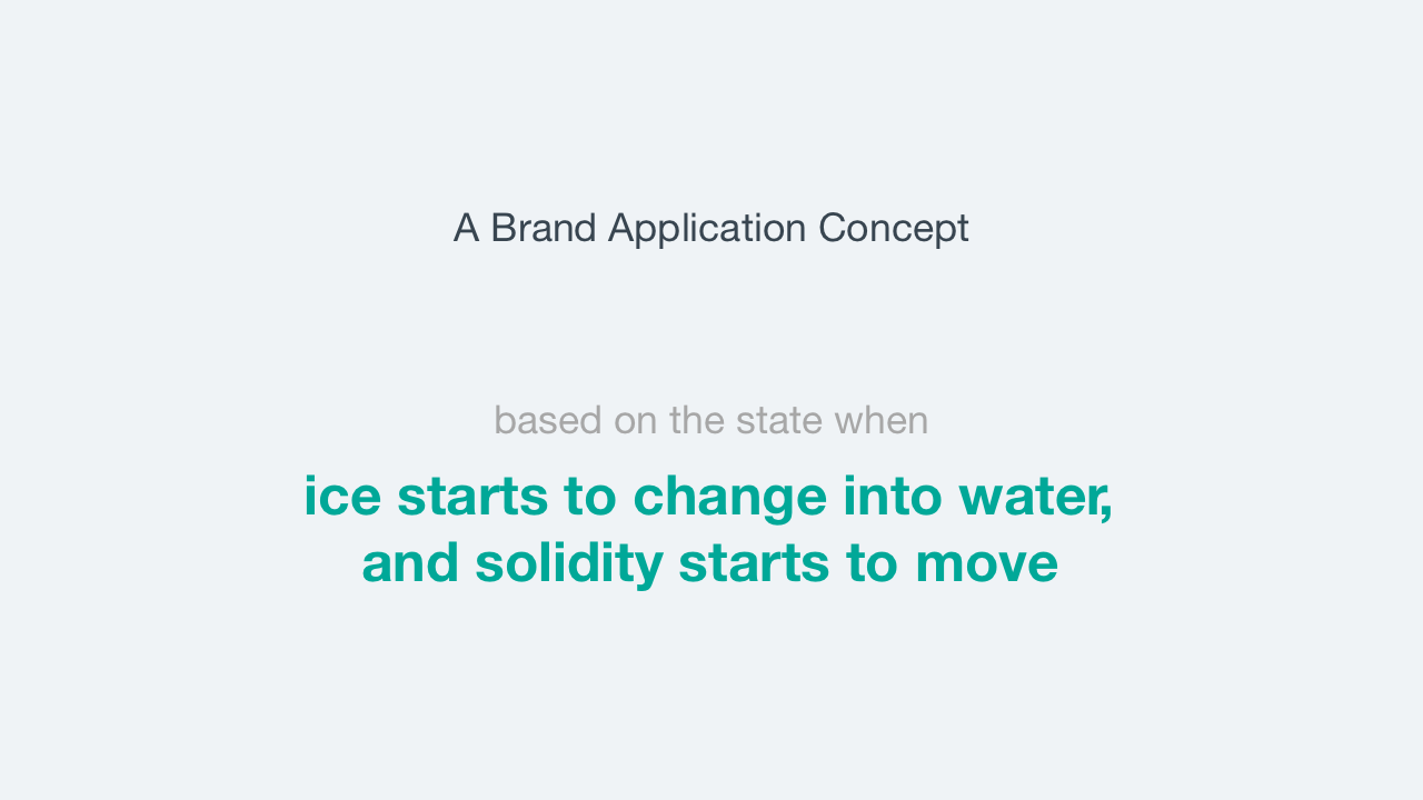
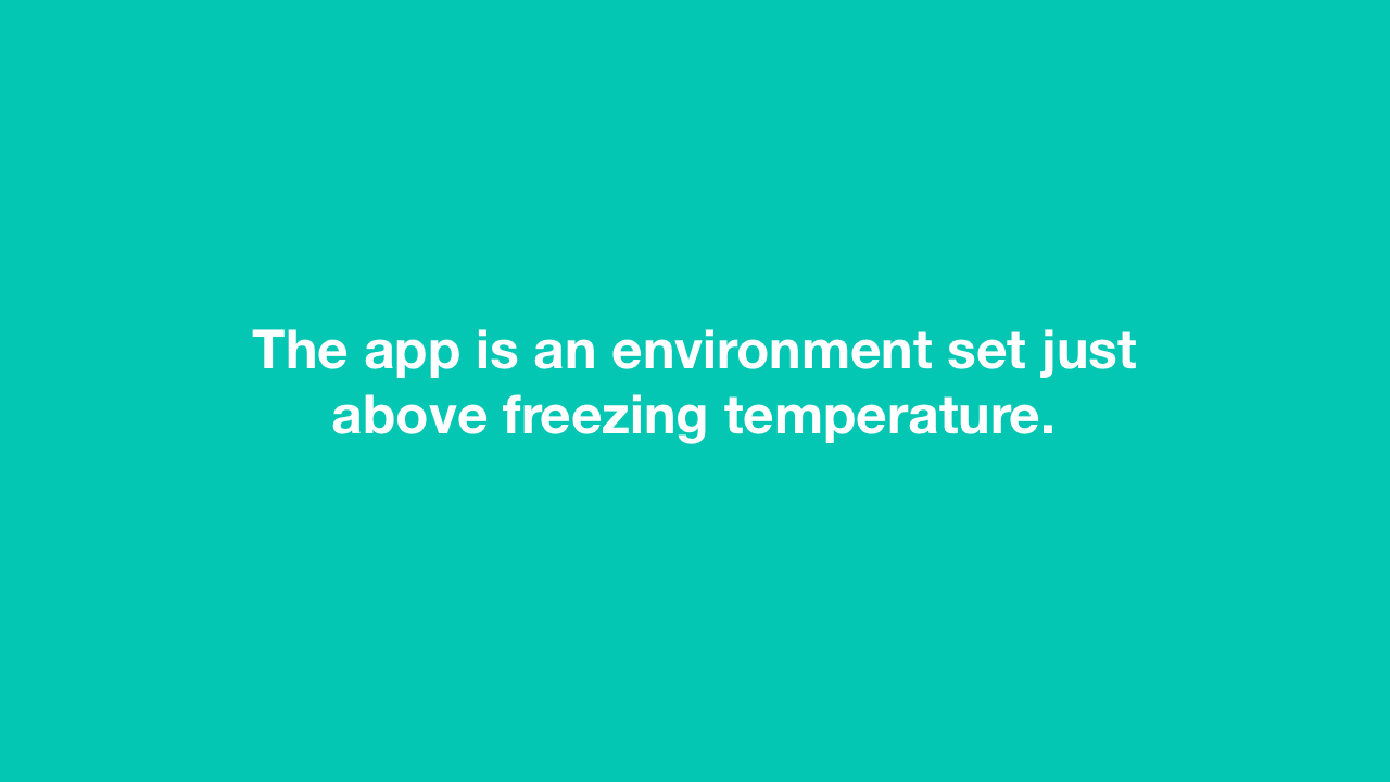
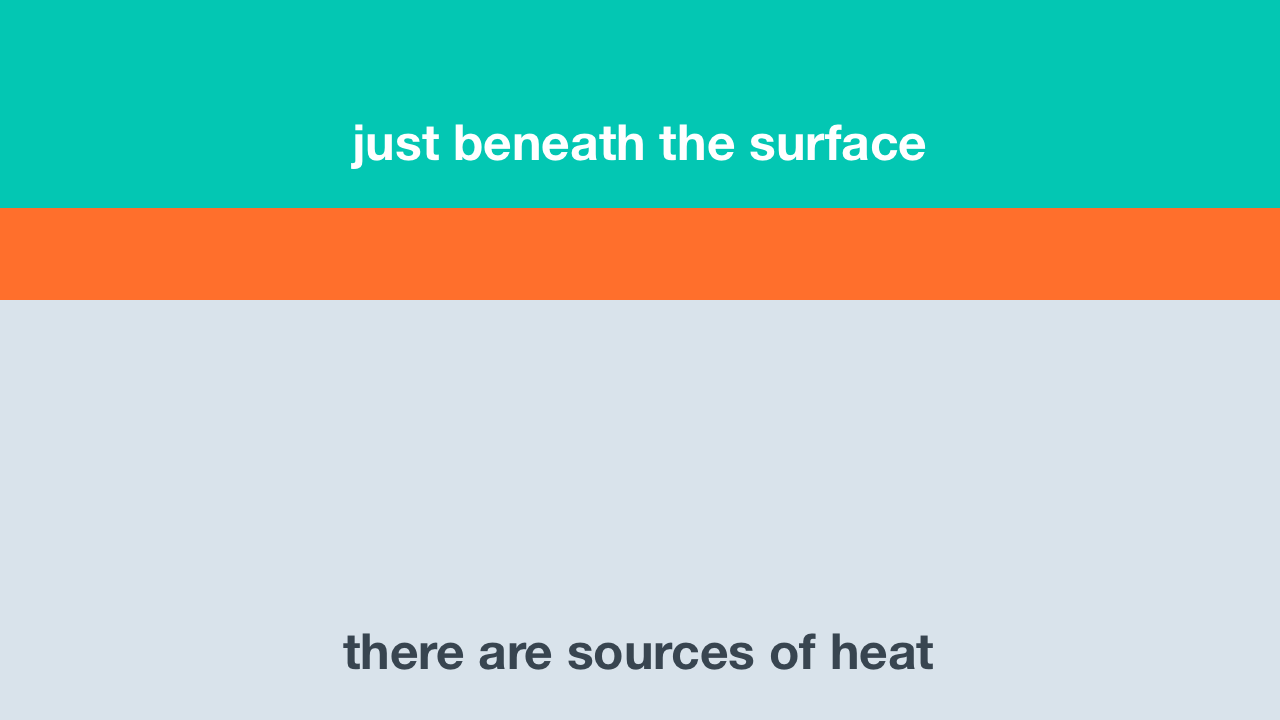
Through explorations, I eventually arrived at a concept I called melt.
The concept provided a foundation for the visuals and animations in the app.


Feedback about the teal and blue UI was varied.
In the next phase, I worked closely with the external marketing designer to iterate on the color choices. We tested on both the marketing context and the product context.
We brought back the orange as a secondary color in the brand but primary color for the app. This was partially because our original designs with orange as the primary color was already vetted by product and marketing stakeholders, prior to the change to teal.

Unfortunately, there was no leadership or product buy-in for the new colors.
The rebrand of colors was put on hold.
In order not to waste work, we started to use some of the same type styles in the app, but without the rebranded colors.
Time passed.
A design language project was prioritized within the design team.
We had some designers leave and new designers join. There was also a new head of design.
There were further discussion about executing the entire rebrand project, but that failed, so our head of design decided to prioritize a redesign of the app to make Venmo more polished and more modern.
During this time I transitioned from designing Commerce features for Venmo to being an Android platform designer.
For our redesign, I wanted to come up with a concept like melt,
—a concept that would guide our visual and animation language. For this phase, I worked closely with our iOS platform designer.
The concept I pitched was duality.
I led a free-association brainstorm, and when we looked at which words we liked and which words fit Venmo, we dwelled a lot on the idea of a swan, where the body is calm, and the feet underneath are tumultuously paddling.
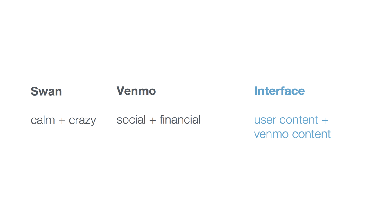
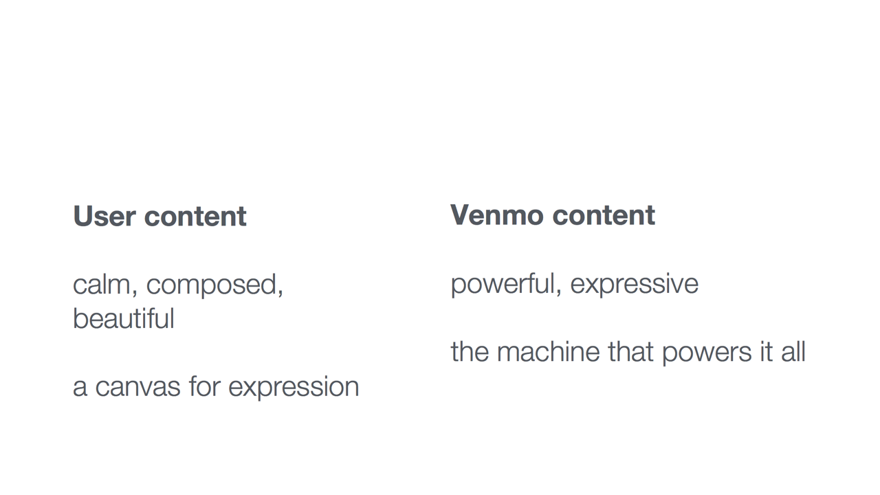
I explored two sets of type styles,
—one bold and expressive, and the other calm and quiet. I arrived at the final selection based largely on their ability to coexist and feel like the same set, while still portraying their own respective characteristics.

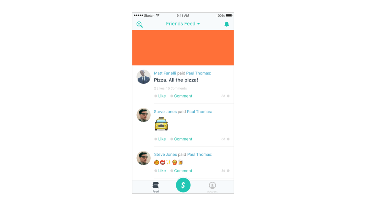
We applied these new styles across a variety of screens in our app.