Bumblebee
Research & explorationLeadership said,
Make a Venmo card.
We asked,
Is a card the right thing for Venmo?
What is the problem we’re trying to solve, and
what are we trying to achieve?
I worked closed with an iOS engineer and a member of the strategy team on this project, with close guidance from the design team lead.
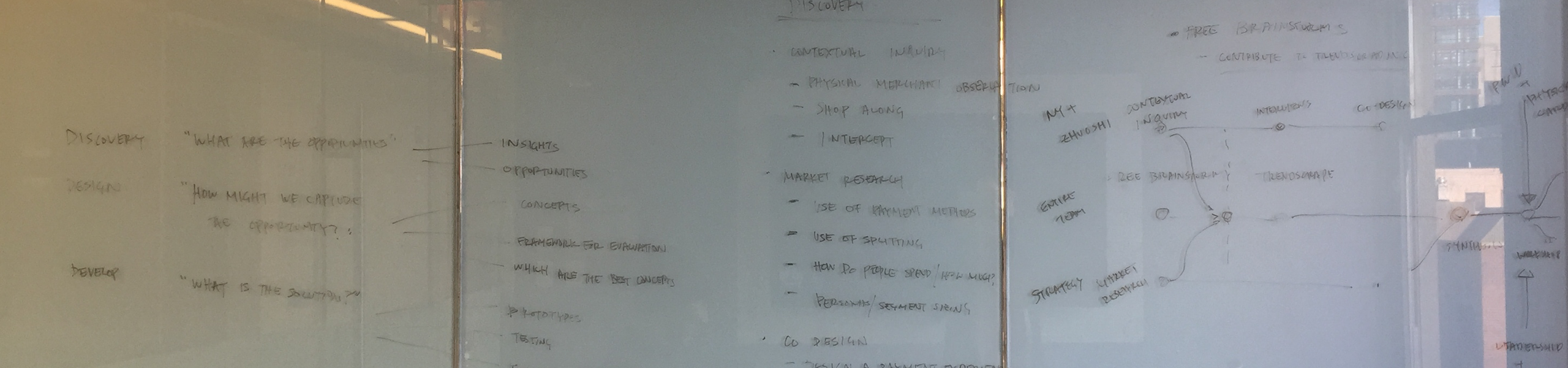
Our process included discovery, design, and validation phases. I planned and facilitated design sprints, and executed design for testing and communication.
What we were trying to achieve was to enable Venmo for physical merchants. We briefly explored POS devices and other solutions that would require merchant integration, but decided that a card is a great way to expand reach in the short term. Our focus then shifted to understanding the question of—
How can we best create value for our users with a Venmo card?
Our main challenge was time.
We wanted to do thorough research to make sure that what we were going to build would be based on real user pain points and desires, not just what we think is cool as a company. Leadership was pushing for designs and prototypes with a deadline of a handful of weeks, so we were trying our best to squeeze in as much research as we could in the beginning.
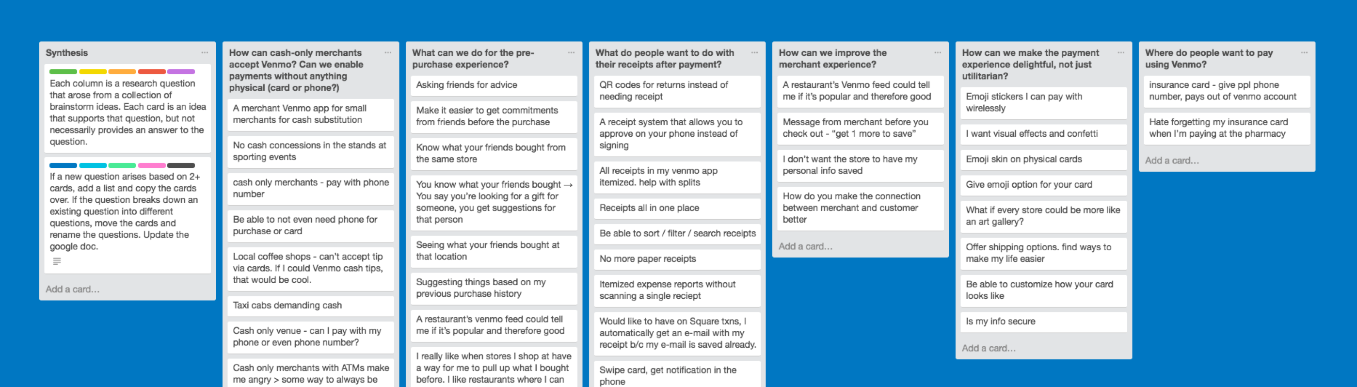
I first ran a brainstorm with the wider Venmo team to get ideas for our research.
I synthesized all the ideas into major themes, and these helped guide us in our research.
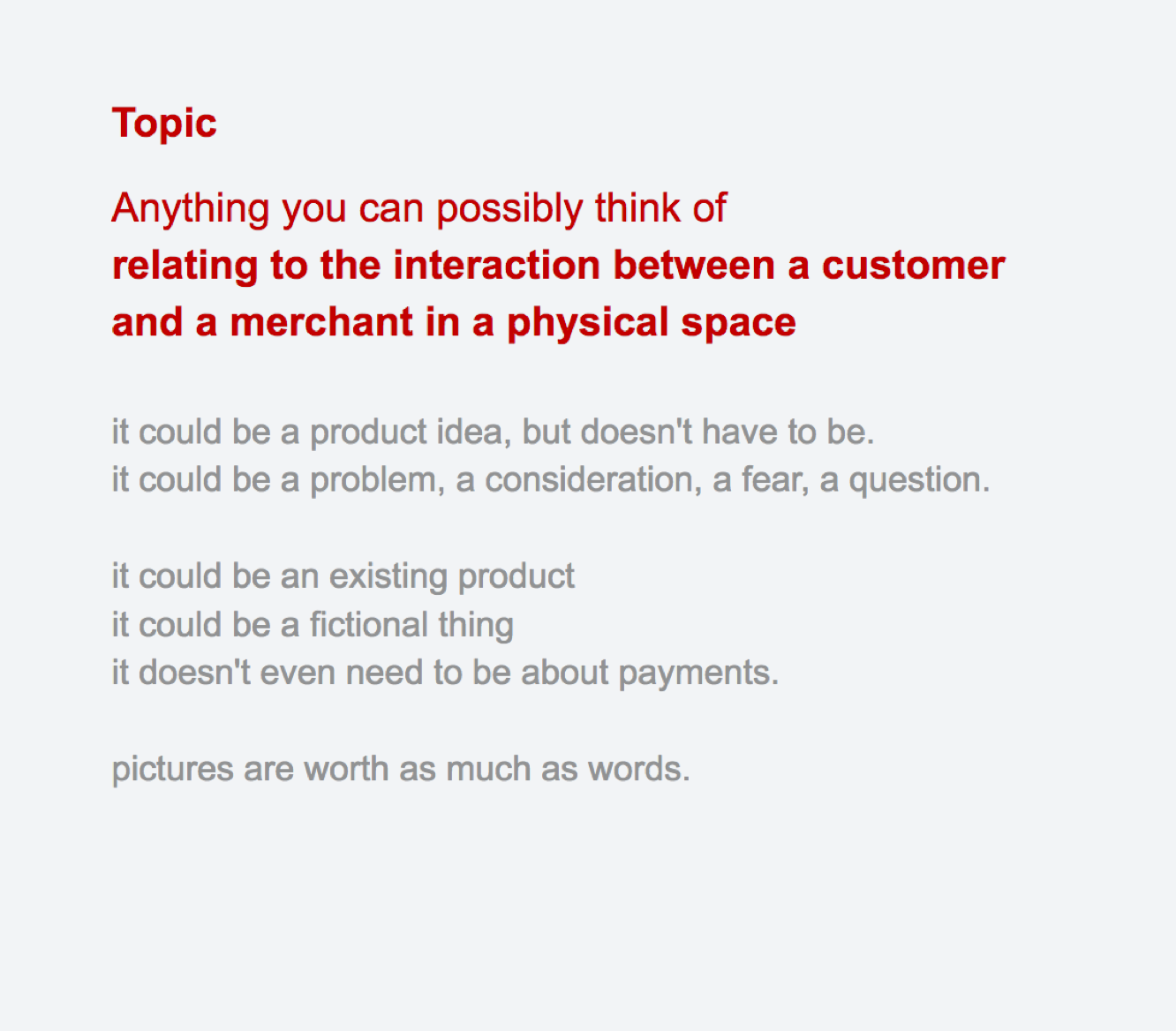
We interviewed about a dozen Venmo users,
—to understand their behaviors in the physical payment experience, and their pain points, and to hear their thoughts about card vs mobile payments, gift cards, and rewards programs.
I created a script for the interviews, with feedback from the design team lead, our in-house user researcher, and other team members.
“Tell us about the last time you paid for something in a store.”
We left our questions open-ended. People told us about their grocery shopping experience, their morning coffee, their subway payment experience, etc.
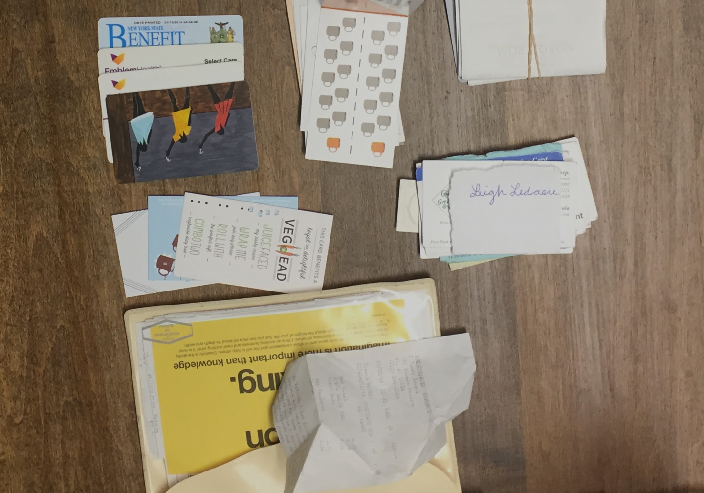
“Talk about everything in your wallet.”
We also wanted to ask questions about card designs and wallet preferences to help us design the Venmo card later on. We ended up also learning more about these people’s experiences and pain points when we asked about the stories of their wallets.
We used trello boards for all of our syntheses. We followed the same process as traditional Affinity Mapping, but used Trello for easier sharing and collaboration.
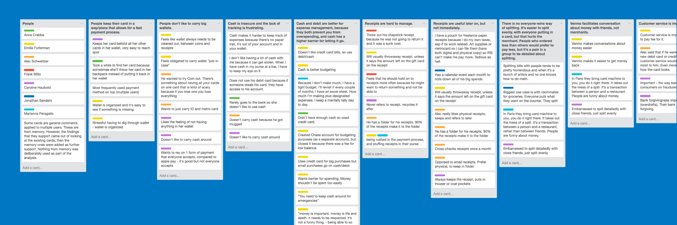
We interviewed users again after the first round of synthesis. Some themes repeated, and we paid the most attention to those.
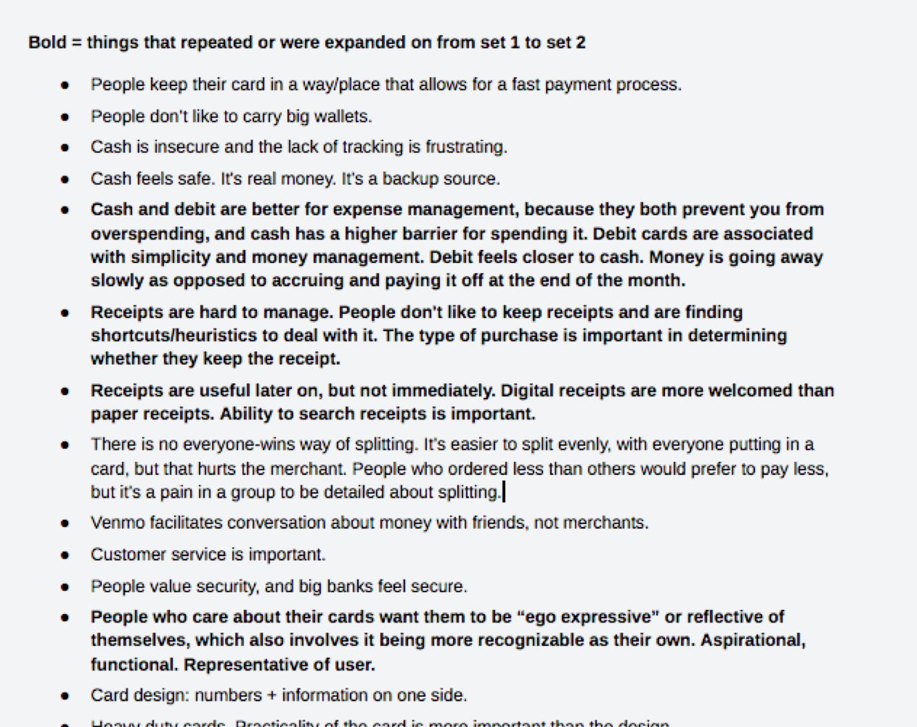
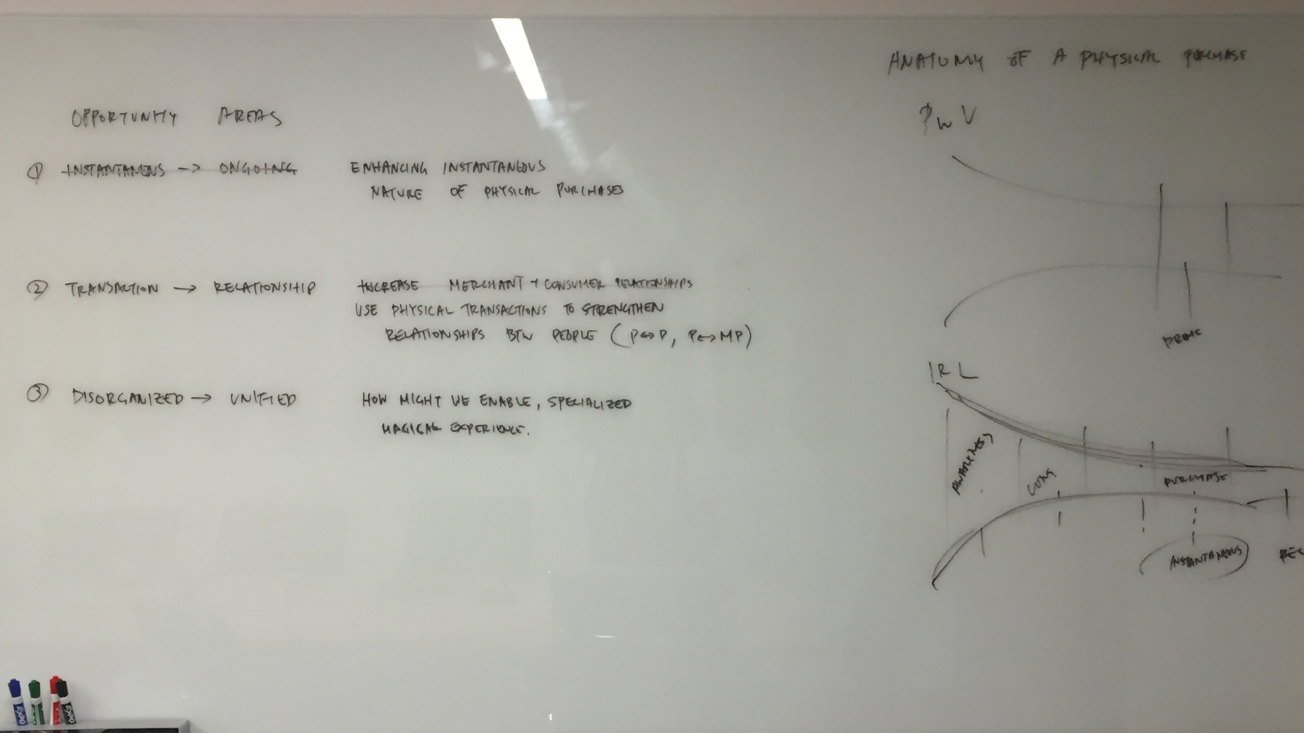
After comparing physical and digital payment spaces, we eventually came away with a picture of the opportunity areas.

To start creating solutions, we ran a design sprint open to everyone at Venmo.
Our goal was to leave with a few ideas that we could test.
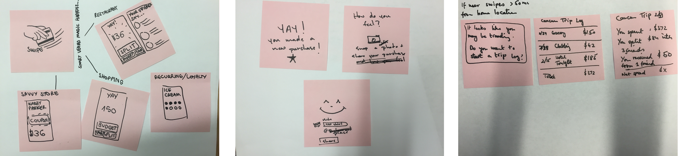
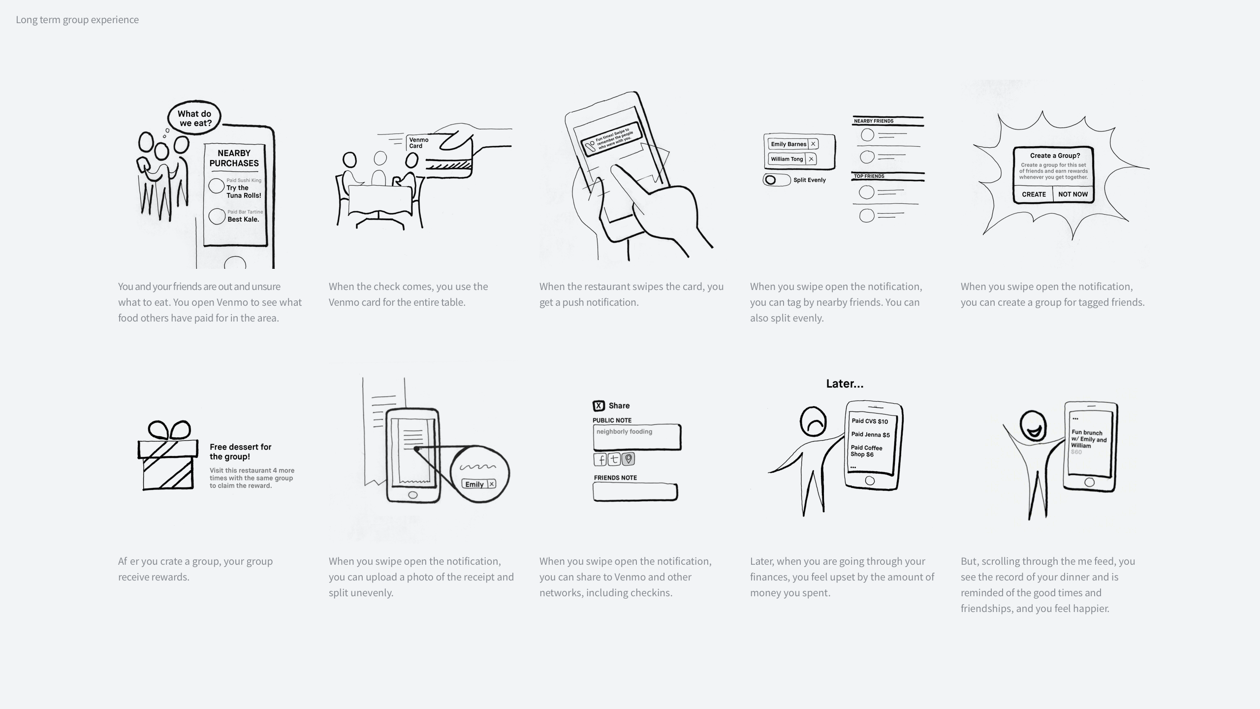
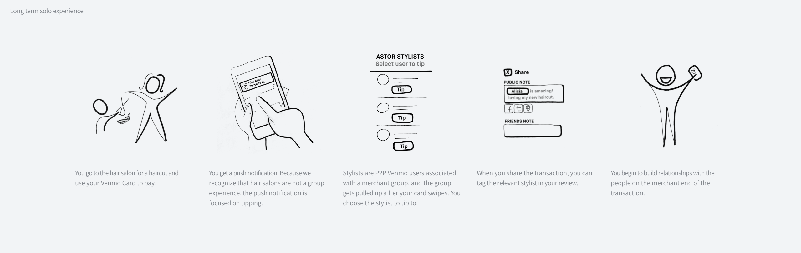
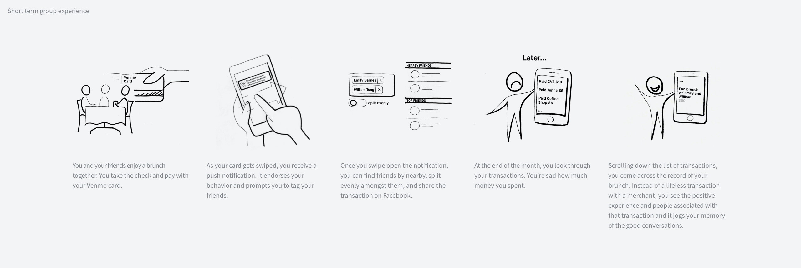
After consolidating everyone’s storyboards, we arrived at three stories.
We wanted to make sure that with what we offer users, whether in the short term or long term, that we were able to articulate the value prop in the form of a story. Without it, a feature is just a gimmick.
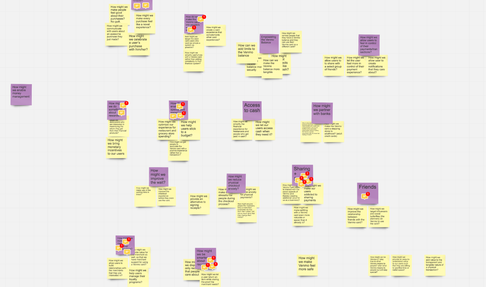
We quickly learned that the specificity of these wireframes was preventing us from getting the feedback we needed. We then switched to testing with illustrations of each feature.
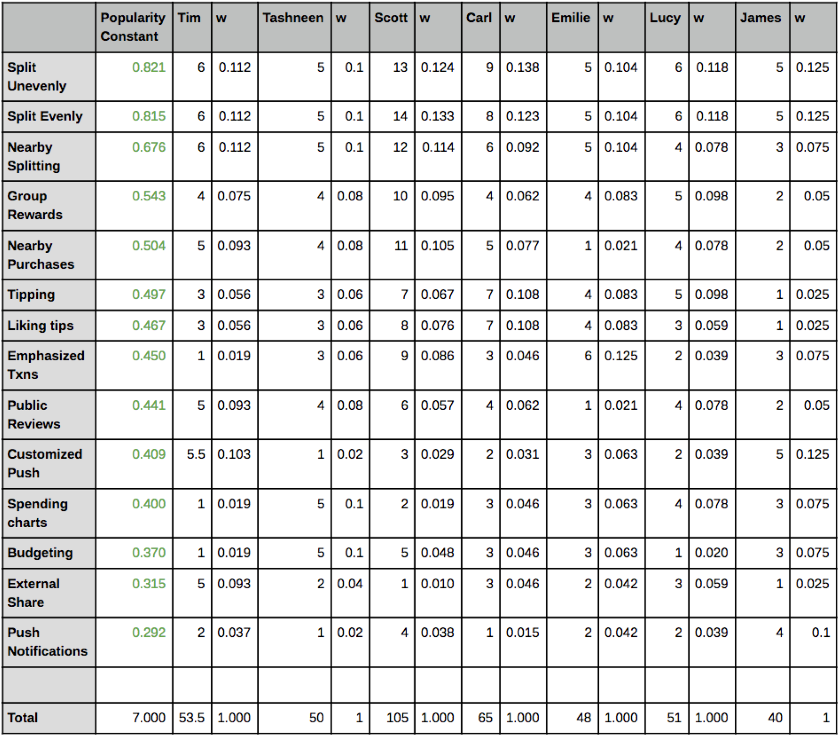
We interviewed another handful of users as asked them to put our feature illustrations in a spectrum. For the creative, they could label their spectrum however they wanted.
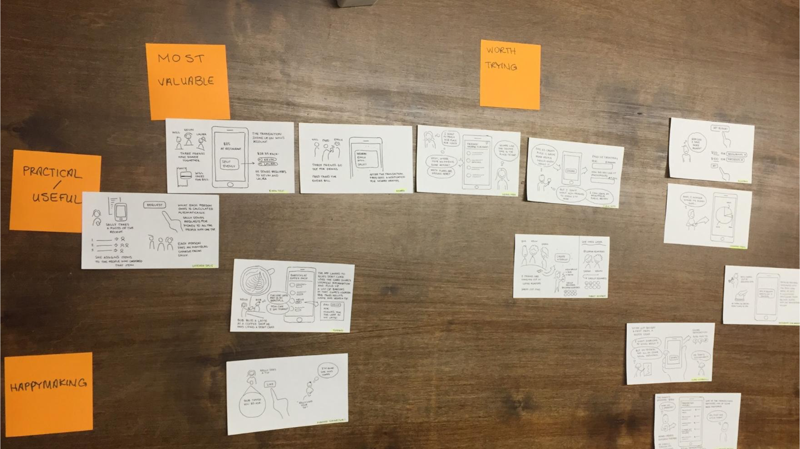
We also paid close attention to their thought process and how they reacted to each feature verbally and non-verbally as they placed them along the spectrum.
“Groups is great. I frequently go out with the same folks. This creates incentive to go out more and use the app.”
We came away with an understanding of what people needed and wanted.
Success
While the project did not get the chance to go into the execution and development stage, the extensive discovery and validation research helped guide prioritization for other projects.
For example, after “Pay with Venmo” launched, our team needed to figure out what the next steps were. Findings from the Bumblebee project were extremely helpful and we quickly decided that improving the Split feature was a top priority.
If I worked on this project today, I would have paid more attention to defining the MVP and the steps to achieve the long term solution. When I worked on this, even the short term solution involved a lot of product changes. It’s hard to execute on something that looks daunting and that has no clear path.